 我的书签
我的书签
 添加书签
添加书签 移除书签
移除书签- 加载占位图
- 何时使用
- 代码演示
- 基本
- 复杂的组合
- 动画效果
- 包含子组件
- 列表
- API
- Skeleton
- SkeletonAvatarProps
- SkeletonTitleProps
- SkeletonParagraphProps
加载占位图
在需要等待加载内容的位置提供一个占位图。
何时使用
- 网络较慢,需要长时间等待加载处理的情况下。
- 图文信息内容较多的列表/卡片中。
代码演示
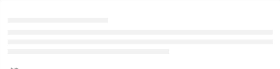
基本
最简单的占位效果。
<template><a-skeleton /></template>
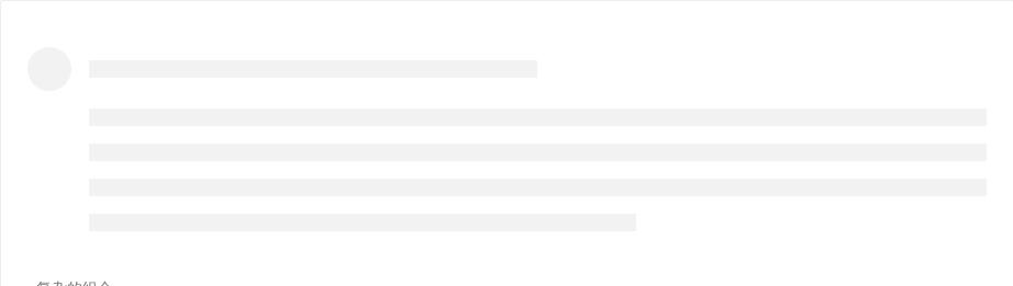
复杂的组合
更复杂的组合。
<template><a-skeleton avatar :paragraph="{rows: 4}" /></template>
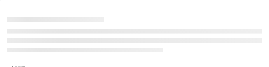
动画效果
显示动画效果。
<template><a-skeleton active /></template>
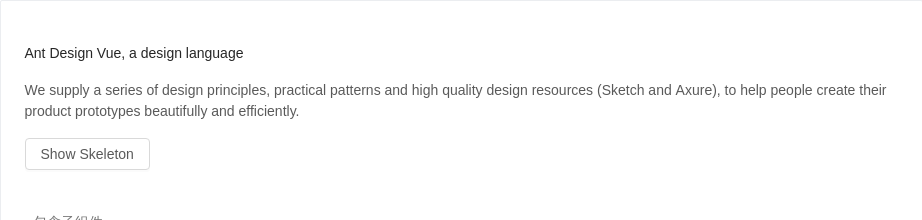
包含子组件
加载占位图包含子组件。
<template><div class="article"><a-skeleton :loading="loading"><div><h4>Ant Design Vue, a design language</h4><p>We supply a series of design principles, practical patterns and high quality design resources (Sketch and Axure), to help people create their product prototypes beautifully and efficiently.</p></div></a-skeleton><a-button @click="showSkeleton" :disabled="loading">Show Skeleton</a-button></div></template><script>export default {data() {return {loading: false,}},methods: {showSkeleton() {this.loading = truesetTimeout(() => {this.loading = false}, 3000);}}}</script><style>.article h4 {margin-bottom: 16px;}.article button {margin-top: 16px;}</style>
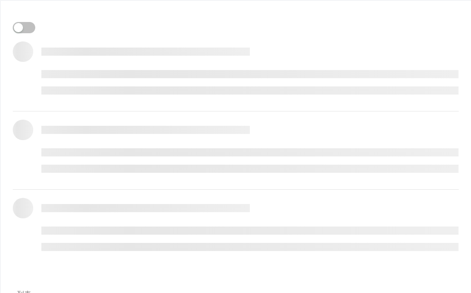
列表
在列表组件中使用加载占位符。
<template><div><a-switch :checked="!loading" @change="onChange" /><a-listitemLayout="vertical"size="large":dataSource="listData"><a-list-item slot="renderItem" slot-scope="item, index" key="item.title"><template v-if="!loading" slot="actions" v-for="{type, text} in actions"><span :key="type"><a-icon :type="type" style="margin-right: 8px" />{{text}}</span></template><img v-if="!loading" slot="extra" width="272" alt="logo" src="https://gw.alipayobjects.com/zos/rmsportal/mqaQswcyDLcXyDKnZfES.png" /><a-skeleton :loading="loading" active avatar><a-list-item-meta:description="item.description"><a slot="title" :href="item.href">{{item.title}}</a><a-avatar slot="avatar" :src="item.avatar" /></a-list-item-meta>{{item.content}}</a-skeleton></a-list-item></a-list></div></template><script>const listData = [];for (let i = 0; i < 3; i++) {listData.push({href: 'https://vue.ant.design/',title: `ant design vue part ${i}`,avatar: 'https://zos.alipayobjects.com/rmsportal/ODTLcjxAfvqbxHnVXCYX.png',description: 'Ant Design, a design language for background applications, is refined by Ant UED Team.',content: 'We supply a series of design principles, practical patterns and high quality design resources (Sketch and Axure), to help people create their product prototypes beautifully and efficiently.',});}export default {data() {return {loading: true,listData,actions: [{ type: 'star-o', text: '156' },{ type: 'like-o', text: '156' },{ type: 'message', text: '2' },],}},methods: {onChange(checked) {this.loading = !checked}}}</script><style>.skeleton-demo {border: 1px solid #f4f4f4;}</style>
API
Skeleton
| 属性 | 说明 | 类型 | 默认值 |
|---|---|---|---|
| active | 是否展示动画效果 | boolean | false |
| avatar | 是否显示头像占位图 | boolean | SkeletonAvatarProps | false |
| loading | 为 true 时,显示占位图。反之则直接展示子组件 | boolean | - |
| paragraph | 是否显示段落占位图 | boolean | SkeletonParagraphProps | true |
| title | 是否显示标题占位图 | boolean | SkeletonTitleProps | true |
SkeletonAvatarProps
| 属性 | 说明 | 类型 | 默认值 |
|---|---|---|---|
| size | 设置头像占位图的大小 | Enum{ 'large', 'small', 'default' } | - |
| shape | 指定头像的形状 | Enum{ 'circle', 'square' } | - |
SkeletonTitleProps
| 属性 | 说明 | 类型 | 默认值 |
|---|---|---|---|
| width | 设置标题占位图的宽度 | number | string | - |
SkeletonParagraphProps
| 属性 | 说明 | 类型 | 默认值 |
|---|---|---|---|
| rows | 设置段落占位图的行数 | number | - |
| width | 设置段落占位图的宽度,若为数组时则为对应的每行宽度,反之则是最后一行的宽度 | number | string | Array<number | string> | - |
