 我的书签
我的书签
 添加书签
添加书签 移除书签
移除书签- 列表
- 何时使用
- 代码演示
- 基础列表
- 栅格列表
- 加载更多
- 响应式的栅格列表
- 简单列表
- 竖排列表样式
- 滚动加载
- 滚动加载无限长列表
- API
- List
- pagination
- List grid props
- List.Item
- List.Item.Meta
列表
通用列表。
何时使用
最基础的列表展示,可承载文字、列表、图片、段落,常用于后台数据展示页面。
代码演示
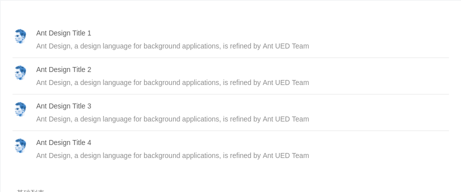
基础列表
基础列表。
<template><a-listitemLayout="horizontal":dataSource="data"><a-list-item slot="renderItem" slot-scope="item, index"><a-list-item-metadescription="Ant Design, a design language for background applications, is refined by Ant UED Team"><a slot="title" href="https://vue.ant.design/">{{item.title}}</a><a-avatar slot="avatar" src="https://zos.alipayobjects.com/rmsportal/ODTLcjxAfvqbxHnVXCYX.png" /></a-list-item-meta></a-list-item></a-list></template><script>const data = [{title: 'Ant Design Title 1',},{title: 'Ant Design Title 2',},{title: 'Ant Design Title 3',},{title: 'Ant Design Title 4',},]export default {data () {return {data,}},}</script><style></style>
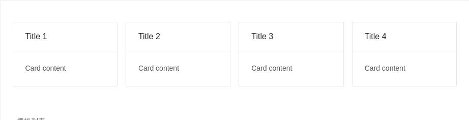
栅格列表
可以通过设置 List 的 grid 属性来实现栅格列表,column 可设置期望显示的列数。
<template><a-list:grid="{ gutter: 16, column: 4 }":dataSource="data"><a-list-item slot="renderItem" slot-scope="item, index"><a-card :title="item.title">Card content</a-card></a-list-item></a-list></template><script>const data = [{title: 'Title 1',},{title: 'Title 2',},{title: 'Title 3',},{title: 'Title 4',},]export default {data () {return {data,}},}</script><style></style>
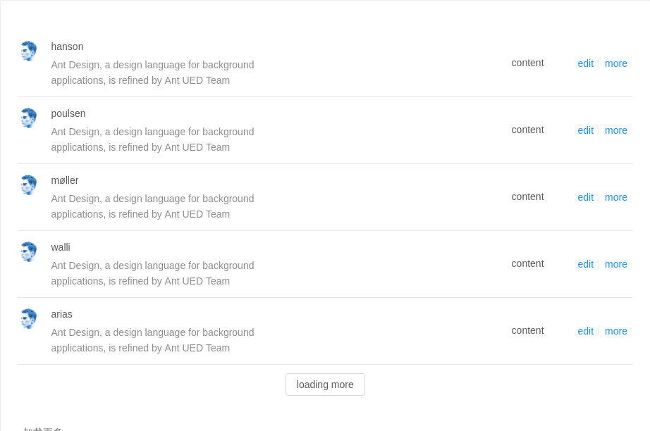
加载更多
可通过 loadMore 属性实现加载更多功能。
<template><a-listclass="demo-loadmore-list":loading="loading"itemLayout="horizontal":dataSource="data"><div v-if="showLoadingMore" slot="loadMore" :style="{ textAlign: 'center', marginTop: '12px', height: '32px', lineHeight: '32px' }"><a-spin v-if="loadingMore" /><a-button v-else @click="onLoadMore">loading more</a-button></div><a-list-item slot="renderItem" slot-scope="item, index"><a slot="actions">edit</a><a slot="actions">more</a><a-list-item-metadescription="Ant Design, a design language for background applications, is refined by Ant UED Team"><a slot="title" href="https://vue.ant.design/">{{item.name.last}}</a><a-avatar slot="avatar" src="https://zos.alipayobjects.com/rmsportal/ODTLcjxAfvqbxHnVXCYX.png" /></a-list-item-meta><div>content</div></a-list-item></a-list></template><script>import reqwest from 'reqwest'const fakeDataUrl = 'https://randomuser.me/api/?results=5&inc=name,gender,email,nat&noinfo'export default {data () {return {loading: true,loadingMore: false,showLoadingMore: true,data: [],}},mounted () {this.getData((res) => {this.loading = falsethis.data = res.results})},methods: {getData (callback) {reqwest({url: fakeDataUrl,type: 'json',method: 'get',contentType: 'application/json',success: (res) => {callback(res)},})},onLoadMore () {this.loadingMore = truethis.getData((res) => {this.data = this.data.concat(res.results)this.loadingMore = falsethis.$nextTick(() => {window.dispatchEvent(new Event('resize'))})})},},}</script><style>.demo-loadmore-list {min-height: 350px;}</style>
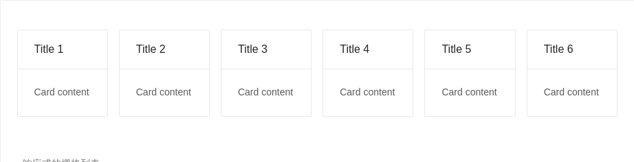
响应式的栅格列表
响应式的栅格列表。尺寸与 Layout Grid 保持一致。
<template><a-list:grid="{ gutter: 16, xs: 1, sm: 2, md: 4, lg: 4, xl: 6, xxl: 3 }":dataSource="data"><a-list-item slot="renderItem" slot-scope="item, index"><a-card :title="item.title">Card content</a-card></a-list-item></a-list></template><script>const data = [{title: 'Title 1',},{title: 'Title 2',},{title: 'Title 3',},{title: 'Title 4',},{title: 'Title 5',},{title: 'Title 6',},]export default {data () {return {data,}},}</script><style></style>
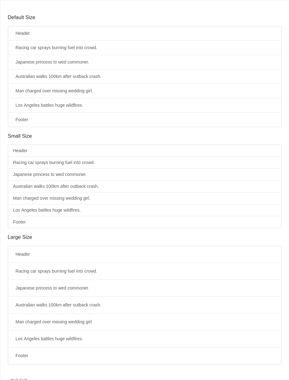
简单列表
列表拥有大、中、小三种尺寸。通过设置 size 为 large small 分别把按钮设为大、小尺寸。若不设置 size,则尺寸为中。可通过设置 header 和 footer,来自定义列表头部和尾部。
<template><div><h3 :style="{ marginBottom: '16px' }">Default Size</h3><a-listbordered:dataSource="data"><a-list-item slot="renderItem" slot-scope="item, index">{{item}}</a-list-item><div slot="header">Header</div><div slot="footer">Footer</div></a-list><h3 :style="{ margin: '16px 0' }">Small Size</h3><a-listsize="small"bordered:dataSource="data"><a-list-item slot="renderItem" slot-scope="item, index">{{item}}</a-list-item><div slot="header">Header</div><div slot="footer">Footer</div></a-list><h3 :style="{ margin: '16px 0' }">Large Size</h3><a-listsize="large"bordered:dataSource="data"><a-list-item slot="renderItem" slot-scope="item, index">{{item}}</a-list-item><div slot="header">Header</div><div slot="footer">Footer</div></a-list></div></template><script>const data = ['Racing car sprays burning fuel into crowd.','Japanese princess to wed commoner.','Australian walks 100km after outback crash.','Man charged over missing wedding girl.','Los Angeles battles huge wildfires.',]export default {data () {return {data,}},}</script><style></style>
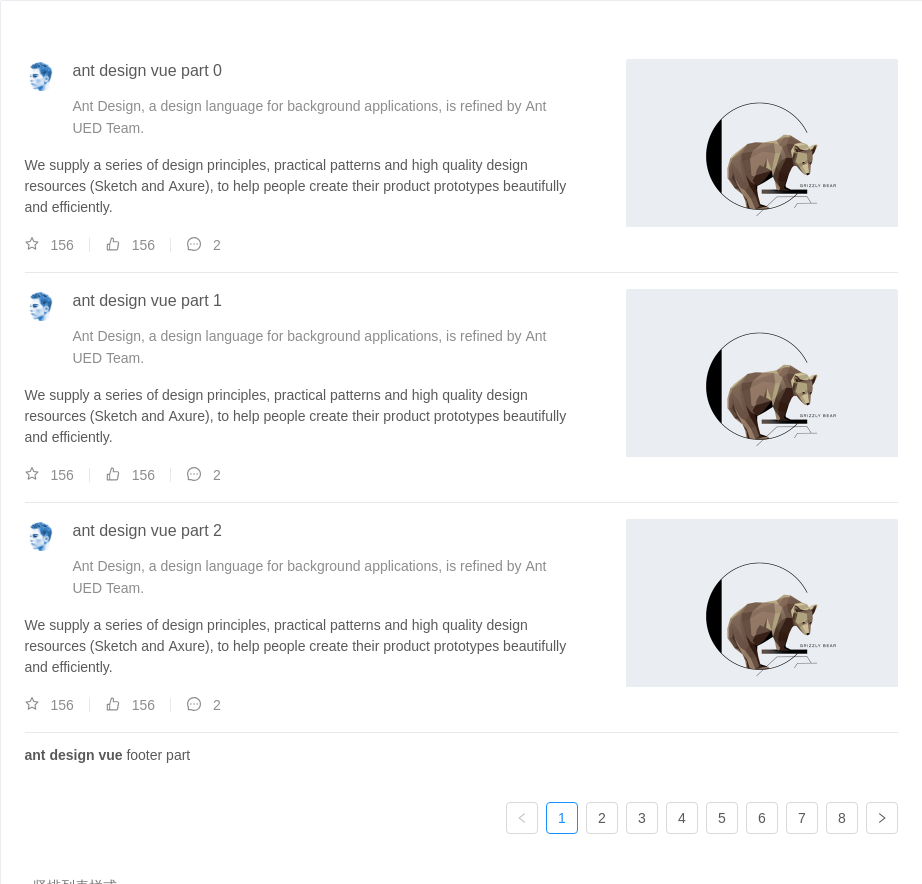
竖排列表样式
通过设置 itemLayout 属性为 vertical 可实现竖排列表样式。
<template><a-listitemLayout="vertical"size="large":pagination="pagination":dataSource="listData"><div slot="footer"><b>ant design vue</b> footer part</div><a-list-item slot="renderItem" slot-scope="item, index" key="item.title"><template slot="actions" v-for="{type, text} in actions"><span :key="type"><a-icon :type="type" style="margin-right: 8px" />{{text}}</span></template><img slot="extra" width="272" alt="logo" src="https://gw.alipayobjects.com/zos/rmsportal/mqaQswcyDLcXyDKnZfES.png" /><a-list-item-meta:description="item.description"><a slot="title" :href="item.href">{{item.title}}</a><a-avatar slot="avatar" :src="item.avatar" /></a-list-item-meta>{{item.content}}</a-list-item></a-list></template><script>const listData = []for (let i = 0; i < 23; i++) {listData.push({href: 'https://vue.ant.design/',title: `ant design vue part ${i}`,avatar: 'https://zos.alipayobjects.com/rmsportal/ODTLcjxAfvqbxHnVXCYX.png',description: 'Ant Design, a design language for background applications, is refined by Ant UED Team.',content: 'We supply a series of design principles, practical patterns and high quality design resources (Sketch and Axure), to help people create their product prototypes beautifully and efficiently.',})}export default {data () {return {listData,pagination: {onChange: (page) => {console.log(page);},pageSize: 3,},actions: [{ type: 'star-o', text: '156' },{ type: 'like-o', text: '156' },{ type: 'message', text: '2' },],}},}</script><style></style>
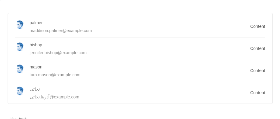
滚动加载
结合 vue-infinite-scroll 实现滚动自动加载列表。
<template><divclass="demo-infinite-container"v-infinite-scroll="handleInfiniteOnLoad":infinite-scroll-disabled="busy":infinite-scroll-distance="10"><a-list:dataSource="data"><a-list-item slot="renderItem" slot-scope="item, index"><a-list-item-meta :description="item.email"><a slot="title" :href="item.href">{{item.name.last}}</a><a-avatar slot="avatar" src="https://zos.alipayobjects.com/rmsportal/ODTLcjxAfvqbxHnVXCYX.png" /></a-list-item-meta><div>Content</div></a-list-item><div v-if="loading && !busy" class="demo-loading-container"><a-spin /></div></a-list></div></template><script>import reqwest from 'reqwest'import infiniteScroll from 'vue-infinite-scroll'const fakeDataUrl = 'https://randomuser.me/api/?results=5&inc=name,gender,email,nat&noinfo'export default {directives: { infiniteScroll },data () {return {data: [],loading: false,busy: false,}},beforeMount () {this.fetchData((res) => {this.data = res.results})},methods: {fetchData (callback) {reqwest({url: fakeDataUrl,type: 'json',method: 'get',contentType: 'application/json',success: (res) => {callback(res)},})},handleInfiniteOnLoad () {const data = this.datathis.loading = trueif (data.length > 14) {this.$message.warning('Infinite List loaded all')this.busy = truethis.loading = falsereturn}this.fetchData((res) => {this.data = data.concat(res.results)this.loading = false})},},}</script><style>.demo-infinite-container {border: 1px solid #e8e8e8;border-radius: 4px;overflow: auto;padding: 8px 24px;height: 300px;}.demo-loading-container {position: absolute;bottom: 40px;width: 100%;text-align: center;}</style>
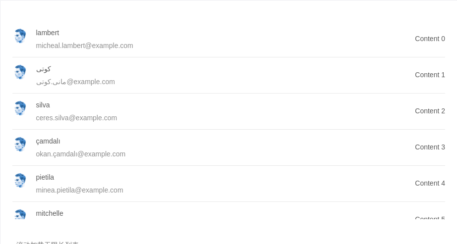
滚动加载无限长列表
结合 vue-virtual-scroller 实现滚动加载无限长列表,带有虚拟化(virtualization)功能,能够提高数据量大时候长列表的性能。可以结合 vue-infinite-scroll 实现滚动自动加载无限长列表。 virtualized 是在大数据列表中应用的一种技术,主要是为了减少不可见区域不必要的渲染从而提高性能,特别是数据量在成千上万条效果尤为明显。
<template><a-list><virtual-scrollerstyle="height: 400px":items="data"item-height="73"v-infinite-scroll="handleInfiniteOnLoad":infinite-scroll-disabled="busy":infinite-scroll-distance="10"><a-list-item slot-scope="{item}"><a-list-item-meta :description="item.email"><a slot="title" :href="item.href">{{item.name.last}}</a><a-avatar slot="avatar" src="https://zos.alipayobjects.com/rmsportal/ODTLcjxAfvqbxHnVXCYX.png" /></a-list-item-meta><div>Content {{item.index}}</div></a-list-item></virtual-scroller><a-spin v-if="loading" class="demo-loading" /></a-list></template><script>import reqwest from 'reqwest'import infiniteScroll from 'vue-infinite-scroll'import { VirtualScroller } from 'vue-virtual-scroller'const fakeDataUrl = 'https://randomuser.me/api/?results=10&inc=name,gender,email,nat&noinfo'export default {directives: { infiniteScroll },data () {return {data: [],loading: false,busy: false,}},beforeMount () {this.fetchData((res) => {this.data = res.results.map((item, index) => ({ ...item, index }))})},methods: {fetchData (callback) {reqwest({url: fakeDataUrl,type: 'json',method: 'get',contentType: 'application/json',success: (res) => {callback(res)},})},handleInfiniteOnLoad () {const data = this.datathis.loading = trueif (data.length > 100) {this.$message.warning('Infinite List loaded all')this.busy = truethis.loading = falsereturn}this.fetchData((res) => {this.data = data.concat(res.results).map((item, index) => ({ ...item, index }))this.loading = false})},},components: {'virtual-scroller': VirtualScroller,},}</script><style>.demo-loading {position: absolute;bottom: 40px;width: 100%;text-align: center;}</style>
API
List
| 参数 | 说明 | 类型 | 默认值 |
|---|---|---|---|
| bordered | 是否展示边框 | boolean | false |
| footer | 列表底部 | string|slot | - |
| grid | 列表栅格配置 | object | - |
| header | 列表头部 | string|slot | - |
| itemLayout | 设置 List.Item 布局, 设置成 vertical 则竖直样式显示, 默认横排 | string | - |
| loading | 当卡片内容还在加载中时,可以用 loading 展示一个占位 | boolean|object | false |
| loadMore | 加载更多 | string|slot | - |
| locale | 默认文案设置,目前包括空数据文案 | object | emptyText: '暂无数据' |
| pagination | 对应的 pagination 配置, 设置 false 不显示 | boolean|object | false |
| size | list 的尺寸 | default | middle | small | default |
| split | 是否展示分割线 | boolean | true |
| renderItem | 自定义Item函数,也可使用slot="renderItem" 和 slot-scope="item, index" | (item, index) => vNode | |
| rowKey | 各项 key 的取值,可以是字符串或一个函数 | item => string|number |
pagination
分页的配置项。
| 参数 | 说明 | 类型 | 默认值 |
|---|---|---|---|
| position | 指定分页显示的位置 | 'top' | 'bottom' | 'both' | 'bottom' |
更多配置项,请查看 Pagination。
List grid props
| 参数 | 说明 | 类型 | 默认值 |
|---|---|---|---|
| column | 列数 | number oneOf [ 1, 2, 3, 4, 6, 8, 12, 24] | - |
| gutter | 栅格间隔 | number | 0 |
| xs | <576px 展示的列数 | number | - |
| sm | ≥576px 展示的列数 | number | - |
| md | ≥768px 展示的列数 | number | - |
| lg | ≥992px 展示的列数 | number | - |
| xl | ≥1200px 展示的列数 | number | - |
| xxl | ≥1600px 展示的列数 | number | - |
List.Item
| 参数 | 说明 | 类型 | 默认值 |
|---|---|---|---|
| actions | 列表操作组,根据 itemLayout 的不同, 位置在卡片底部或者最右侧 | Array<vNode>/ | slot |
| extra | 额外内容, 通常用在 itemLayout 为 vertical 的情况下, 展示右侧内容; horizontal 展示在列表元素最右侧 | string|slot | - |
List.Item.Meta
| 参数 | 说明 | 类型 | 默认值 |
|---|---|---|---|
| avatar | 列表元素的图标 | slot | - |
| description | 列表元素的描述内容 | string|slot | - |
| title | 列表元素的标题 | string|slot | - |
