 我的书签
我的书签
 添加书签
添加书签 移除书签
移除书签- Steps
- 何时使用
- 代码演示
- 基本用法
- 迷你版
- 带图标的步骤条
- 步骤切换
- 竖直方向的步骤条
- 竖直方向的小型步骤条
- 步骤运行错误
- 点状步骤条
- 自定义点状步骤条
- Steps
- Steps.Step
Steps
引导用户按照流程完成任务的导航条。
何时使用
当任务复杂或者存在先后关系时,将其分解成一系列步骤,从而简化任务。
代码演示
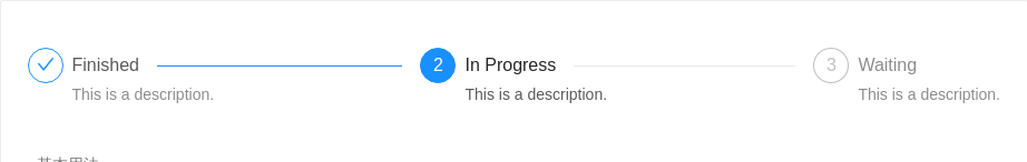
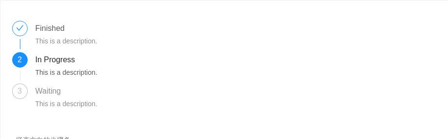
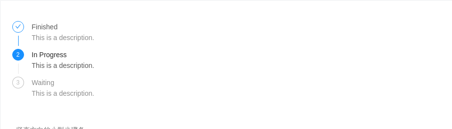
基本用法
简单的步骤条。
<template><a-steps :current="1"><a-step><!-- <span slot="title">Finished</span> --><template slot="title">Finished</template><span slot="description">This is a description.</span></a-step><a-step title="In Progress" description="This is a description." /><a-step title="Waiting" description="This is a description." /></a-steps></template>
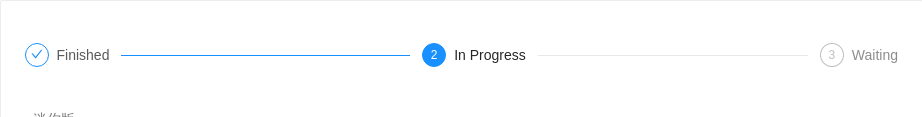
迷你版
迷你版的步骤条,通过设置 <Steps size="small"> 启用。
<template><a-steps :current="1" size="small"><a-step title="Finished" /><a-step title="In Progress" /><a-step title="Waiting" /></a-steps></template>
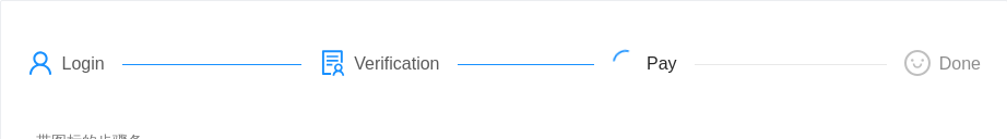
带图标的步骤条
通过设置 Steps.Step 的 icon 属性,可以启用自定义图标。
<template><a-steps><a-step status="finish" title="Login"><a-icon type="user" slot="icon"/></a-step><a-step status="finish" title="Verification"><a-icon type="solution" slot="icon"/></a-step><a-step status="process" title="Pay"><a-icon type="loading" slot="icon"/></a-step><a-step status="wait" title="Done"><a-icon type="smile-o" slot="icon"/></a-step></a-steps></template>
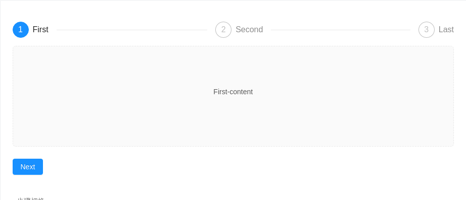
步骤切换
通常配合内容及按钮使用,表示一个流程的处理进度。
<template><div><a-steps :current="current"><a-step v-for="item in steps" :key="item.title" :title="item.title" /></a-steps><div class="steps-content">{{steps[current].content}}</div><div class="steps-action"><a-buttonv-if="current < steps.length - 1"type="primary" @click="next">Next</a-button><a-buttonv-if="current == steps.length - 1"type="primary"@click="$message.success('Processing complete!')">Done</a-button><a-buttonv-if="current>0"style="margin-left: 8px"@click="prev">Previous</a-button></div></div></template><script>export default {data() {return {current: 0,steps: [{title: 'First',content: 'First-content',}, {title: 'Second',content: 'Second-content',}, {title: 'Last',content: 'Last-content',}],}},methods: {next() {this.current++},prev() {this.current--}},}</script><style scoped>.steps-content {margin-top: 16px;border: 1px dashed #e9e9e9;border-radius: 6px;background-color: #fafafa;min-height: 200px;text-align: center;padding-top: 80px;}.steps-action {margin-top: 24px;}</style>
竖直方向的步骤条
简单的竖直方向的步骤条。
<template><a-steps direction="vertical" :current="1"><a-step title="Finished" description="This is a description." /><a-step title="In Progress" description="This is a description." /><a-step title="Waiting" description="This is a description." /></a-steps></template>
竖直方向的小型步骤条
简单的竖直方向的小型步骤条。
<template><a-steps direction="vertical" size="small" :current="1"><a-step title="Finished" description="This is a description." /><a-step title="In Progress" description="This is a description." /><a-step title="Waiting" description="This is a description." /></a-steps></template>
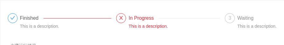
步骤运行错误
使用 Steps 的 status 属性来指定当前步骤的状态。
<template><a-steps :current="1" status="error"><a-step title="Finished" description="This is a description." /><a-step title="In Progress" description="This is a description." /><a-step title="Waiting" description="This is a description." /></a-steps></template>
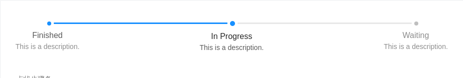
点状步骤条
包含步骤点的进度条。
<template><a-steps progressDot :current="1"><a-step title="Finished" description="This is a description." /><a-step title="In Progress" description="This is a description." /><a-step title="Waiting" description="This is a description." /></a-steps></template>
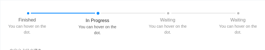
自定义点状步骤条
为点状步骤条增加自定义展示。
<template><div><a-steps :current="1"><a-popover slot="progressDot" slot-scope="{index, status, prefixCls}"><template slot="content"><span>step {{index}} status: {{status}}</span></template><span :class="`${prefixCls}-icon-dot`"></span></a-popover><a-step title="Finished" description="You can hover on the dot." /><a-step title="In Progress" description="You can hover on the dot." /><a-step title="Waiting" description="You can hover on the dot." /><a-step title="Waiting" description="You can hover on the dot." /></a-steps></div></template>
Steps
整体步骤条。
| 参数 | 说明 | 类型 | 默认值 |
|---|---|---|---|
| current | 指定当前步骤,从 0 开始记数。在子 Step 元素中,可以通过 status 属性覆盖状态 | number | 0 |
| direction | 指定步骤条方向。目前支持水平(horizontal)和竖直(vertical)两种方向 | string | horizontal |
| labelPlacement | 指定标签放置位置,默认水平放图标右侧,可选vertical放图标下方 | string | horizontal |
| progressDot | 点状步骤条,可以设置为一个 作用域插槽,labelPlacement 将强制为vertical | Boolean or slot="progressDot" slot-scope="{index, status, title, description, prefixCls})" | false |
| size | 指定大小,目前支持普通(default)和迷你(small) | string | default |
| status | 指定当前步骤的状态,可选 wait process finish error | string | process |
| initial | 起始序号,从 0 开始记数 | number | 0 |
Steps.Step
步骤条内的每一个步骤。
| 参数 | 说明 | 类型 | 默认值 |
|---|---|---|---|
| description | 步骤的详情描述,可选 | string|slot | - |
| icon | 步骤图标的类型,可选 | string|slot | - |
| status | 指定状态。当不配置该属性时,会使用 Steps 的 current 来自动指定状态。可选:wait process finish error | string | wait |
| title | 标题 | string|slot | - |
