 我的书签
我的书签
 添加书签
添加书签 移除书签
移除书签- Button 按钮
- 何时使用
- 组件注册
- 代码演示
- 按钮类型
- 按钮组合
- 不可用状态
- 幽灵按钮
- 图标按钮
- 加载中状态
- 多个按钮组合
- 按钮尺寸
- block 按钮
- API
- 事件
- 事件
Button 按钮
按钮用于开始一个即时操作。
何时使用
标记了一个(或封装一组)操作命令,响应用户点击行为,触发相应的业务逻辑。
组件注册
import { Button } from 'ant-design-vue';Vue.use(Button);
代码演示
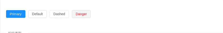
按钮类型
按钮有四种类型:主按钮、次按钮、虚线按钮、危险按钮。主按钮在同一个操作区域最多出现一次。


<template><div><a-button type="primary">Primary</a-button><a-button>Default</a-button><a-button type="dashed">Dashed</a-button><a-button type="danger">Danger</a-button></div></template>
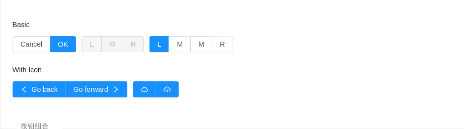
按钮组合
可以将多个 Button 放入 Button.Group 的容器中。通过设置 size 为 large small 分别把按钮组合设为大、小尺寸。若不设置 size,则尺寸为中。
<template><div id="components-button-demo-button-group"><h4>Basic</h4><a-button-group><a-button>Cancel</a-button><a-button type="primary">OK</a-button></a-button-group><a-button-group><a-button disabled>L</a-button><a-button disabled>M</a-button><a-button disabled>R</a-button></a-button-group><a-button-group><a-button type="primary">L</a-button><a-button>M</a-button><a-button>M</a-button><a-button type="dashed">R</a-button></a-button-group><h4>With Icon</h4><a-button-group><a-button type="primary"><a-icon type="left" />Go back</a-button><a-button type="primary">Go forward<a-icon type="right" /></a-button></a-button-group><a-button-group><a-button type="primary" icon="cloud" /><a-button type="primary" icon="cloud-download" /></a-button-group></div></template><style>#components-button-demo-button-group h4 {margin: 16px 0;font-size: 14px;line-height: 1;font-weight: normal;}#components-button-demo-button-group h4:first-child {margin-top: 0;}#components-button-demo-button-group .ant-btn-group {margin-right: 8px;}</style>
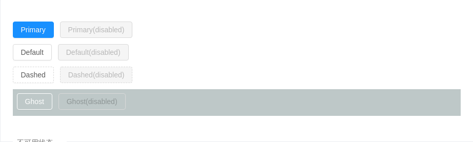
不可用状态
添加 disabled 属性即可让按钮处于不可用状态,同时按钮样式也会改变。
<template><div><a-button type="primary">Primary</a-button><a-button type="primary" disabled>Primary(disabled)</a-button><br /><a-button>Default</a-button><a-button disabled>Default(disabled)</a-button><br /><a-button type="dashed">Dashed</a-button><a-button type="dashed" disabled>Dashed(disabled)</a-button><div :style="{ padding: '8px 8px 0 8px', background: 'rgb(190, 200, 200)' }"><a-button ghost>Ghost</a-button><a-button ghost disabled>Ghost(disabled)</a-button></div></div></template>
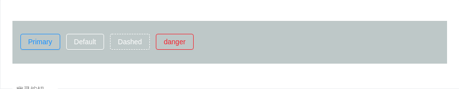
幽灵按钮
幽灵按钮将其他按钮的内容反色,背景变为透明,常用在有色背景上。
<template><div :style="{ background: 'rgb(190, 200, 200)', padding: '26px 16px 16px' }"><a-button type="primary" ghost>Primary</a-button><a-button ghost>Default</a-button><a-button type="dashed" ghost>Dashed</a-button><a-button type="danger" ghost>danger</a-button></div></template>
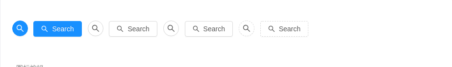
图标按钮
当需要在 Button 内嵌入 Icon 时,可以设置 icon 属性,或者直接在 Button 内使用 Icon 组件。如果想控制 Icon 具体的位置,只能直接使用 Icon 组件,而非 icon 属性。
<template><div><a-button type="primary" shape="circle" icon="search"></a-button><a-button type="primary" icon="search">Search</a-button><a-button shape="circle" icon="search" /><a-button icon="search">Search</a-button><a-button shape="circle" icon="search" /><a-button icon="search">Search</a-button><a-button type="dashed" shape="circle" icon="search" /><a-button type="dashed" icon="search">Search</a-button></div></template>
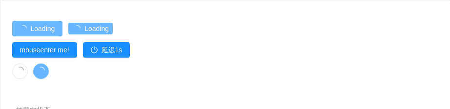
加载中状态
添加 loading 属性即可让按钮处于加载状态,最后两个按钮演示点击后进入加载状态。
<template><div><a-button type="primary" loading>Loading</a-button><a-button type="primary" size="small" loading>Loading</a-button><br /><a-button type="primary" :loading="loading" @mouseenter="enterLoading">mouseenter me!</a-button><a-button type="primary" icon="poweroff" :loading="iconLoading" @click="enterIconLoading">延迟1s</a-button><br /><a-button shape="circle" loading /><a-button type="primary" shape="circle" loading /></div></template><script>export default {data () {return {loading: false,iconLoading: false,}},methods: {enterLoading () {this.loading = true},enterIconLoading () {this.iconLoading = { delay: 1000 }},},}</script>
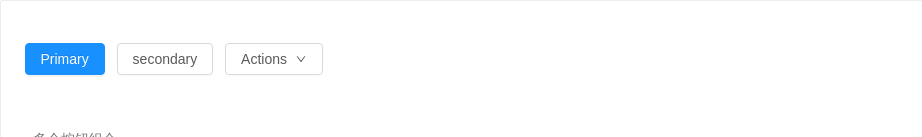
多个按钮组合
按钮组合使用时,推荐使用1个主操作 + n 个次操作,3个以上操作时把更多操作放到 Dropdown.Button 中组合使用。
<template><div><a-button type="primary">Primary</a-button><a-button>secondary</a-button><a-dropdown><a-menu slot="overlay" @click="handleMenuClick"><a-menu-item key="1">1st item</a-menu-item><a-menu-item key="2">2nd item</a-menu-item><a-menu-item key="3">3rd item</a-menu-item></a-menu><a-button>Actions <a-icon type="down" /></a-button></a-dropdown></div></template><script>export default {methods: {handleMenuClick(e) {console.log('click', e);}}}</script>
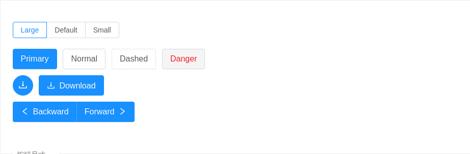
按钮尺寸
按钮有大、中、小三种尺寸。通过设置 size 为 large small 分别把按钮设为大、小尺寸。若不设置 size,则尺寸为中。
<template><div><a-radio-group :value="size" @change="handleSizeChange"><a-radio-button value="large">Large</a-radio-button><a-radio-button value="default">Default</a-radio-button><a-radio-button value="small">Small</a-radio-button></a-radio-group><br /><br /><a-button type="primary" :size="size">Primary</a-button><a-button :size="size">Normal</a-button><a-button type="dashed" :size="size">Dashed</a-button><a-button type="danger" :size="size">Danger</a-button><br /><a-button type="primary" shape="circle" icon="download" :size="size" /><a-button type="primary" icon="download" :size="size">Download</a-button><br /><a-button-group :size="size"><a-button type="primary"><a-icon type="left" />Backward</a-button><a-button type="primary">Forward<a-icon type="right" /></a-button></a-button-group></div></template><script>export default {data () {return {size: 'large',}},methods: {handleSizeChange (e) {this.size = e.target.value},},}</script>
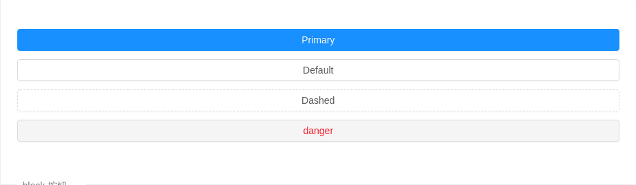
block 按钮
block属性将使按钮适合其父宽度。
<template><div><a-button type="primary" block>Primary</a-button><a-button block>Default</a-button><a-button type="dashed" block>Dashed</a-button><a-button type="danger" block>danger</a-button></div></template>
API
通过设置 Button 的属性来产生不同的按钮样式,推荐顺序为:type -> shape -> size -> loading -> disabled
按钮的属性说明如下:
| 属性 | 说明 | 类型 | 默认值 |
|---|---|---|---|
| disabled | 按钮失效状态 | boolean | false |
| ghost | 幽灵属性,使按钮背景透明 | boolean | false |
| htmlType | 设置 button 原生的 type 值,可选值请参考 HTML 标准 | string | button |
| icon | 设置按钮的图标类型 | string | - |
| loading | 设置按钮载入状态 | boolean | { delay: number } | false |
| shape | 设置按钮形状,可选值为 circle 或者不设 | string | - |
| size | 设置按钮大小,可选值为 small large 或者不设 | string | default |
| type | 设置按钮类型,可选值为 primary dashed danger | string | - |
| block | 将按钮宽度调整为其父宽度的选项 | boolean | false |
事件
| 事件名称 | 说明 | 回调参数 |
|---|---|---|
| click | 点击按钮时的回调 | (event) => void |
<a-button>Hello world!</a-button> 最终会被渲染为 <button><span>Hello world!</span></button>,并且除了上表中的属性,其它属性都会直接传到原生 button 上。
