 我的书签
我的书签
 添加书签
添加书签 移除书签
移除书签- Tooltip
- 何时使用
- 代码演示
- 基本
- 位置
- 箭头指向
- 自动调整位置
- API
- 共同的 API
- 事件
- 注意
Tooltip
简单的文字提示气泡框。
何时使用
鼠标移入则显示提示,移出消失,气泡浮层不承载复杂文本和操作。
可用来代替系统默认的 ‘title’ 提示,提供一个’按钮/文字/操作’的文案解释。
代码演示
基本
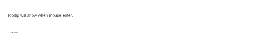
最简单的用法。
<template><a-tooltip><template slot='title'>prompt text</template>Tooltip will show when mouse enter.</a-tooltip></template>
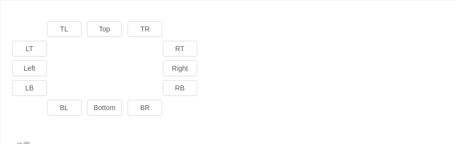
位置
位置有 12 个方向。
<template><div id="components-a-tooltip-demo-placement"><div :style="{ marginLeft: `${buttonWidth}px`, whiteSpace: 'nowrap' }"><a-tooltip placement="topLeft" ><template slot="title"><span>prompt text</span></template><a-button>TL</a-button></a-tooltip><a-tooltip placement="top" ><template slot="title"><span>prompt text</span></template><a-button>Top</a-button></a-tooltip><a-tooltip placement="topRight" ><template slot="title"><span>prompt text</span></template><a-button>TR</a-button></a-tooltip></div><div :style="{ width: `${buttonWidth}px`, float: 'left' }"><a-tooltip placement="leftTop" ><template slot="title"><span>prompt text</span></template><a-button>LT</a-button></a-tooltip><a-tooltip placement="left" ><template slot="title"><span>prompt text</span></template><a-button>Left</a-button></a-tooltip><a-tooltip placement="leftBottom" ><template slot="title"><span>prompt text</span></template><a-button>LB</a-button></a-tooltip></div><div :style="{ width: `${buttonWidth}px`, marginLeft: `${buttonWidth * 4 + 24 }px`}"><a-tooltip placement="rightTop" ><template slot="title"><span>prompt text</span></template><a-button>RT</a-button></a-tooltip><a-tooltip placement="right" ><template slot="title"><span>prompt text</span></template><a-button>Right</a-button></a-tooltip><a-tooltip placement="rightBottom" ><template slot="title"><span>prompt text</span></template><a-button>RB</a-button></a-tooltip></div><div :style="{ marginLeft: `${buttonWidth}px`, clear: 'both', whiteSpace: 'nowrap' }"><a-tooltip placement="bottomLeft" ><template slot="title"><span>prompt text</span></template><a-button>BL</a-button></a-tooltip><a-tooltip placement="bottom" ><template slot="title"><span>prompt text</span></template><