 我的书签
我的书签
 添加书签
添加书签 移除书签
移除书签- Card 卡片
- 何时使用
- 代码演示
- 典型卡片
- 无边框
- 更灵活的内容展示
- 网格型内嵌卡片
- 栅格卡片
- 内部卡片
- 预加载的卡片
- 支持更多内容配置
- 简洁卡片
- 带页签的卡片
- API
- Card
- 事件
- Card.Grid
- Card.Meta
Card 卡片
通用卡片容器
何时使用
最基础的卡片容器,可承载文字、列表、图片、段落,常用于后台概览页面。
代码演示
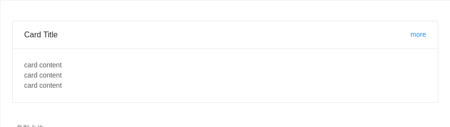
典型卡片
包含标题、内容、操作区域。
<template><a-card title="Card Title"><a href="#" slot="extra">more</a><p>card content</p><p>card content</p><p>card content</p></a-card></template>
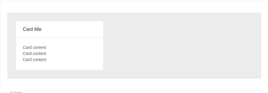
无边框
在灰色背景上使用无边框的卡片
<template><div style="background:#ECECEC; padding:30px"><a-card title="Card title" :bordered="false" style="width: 300px"><p>Card content</p><p>Card content</p><p>Card content</p></a-card></div></template>

更灵活的内容展示
可以利用 Card.Meta 支持更灵活的内容
<template><a-cardhoverablestyle="width: 240px"><imgalt="example"src="https://os.alipayobjects.com/rmsportal/QBnOOoLaAfKPirc.png"slot="cover"/><a-card-metatitle="Europe Street beat"><template slot="description">www.instagram.com</template></a-card-meta></a-card></template>
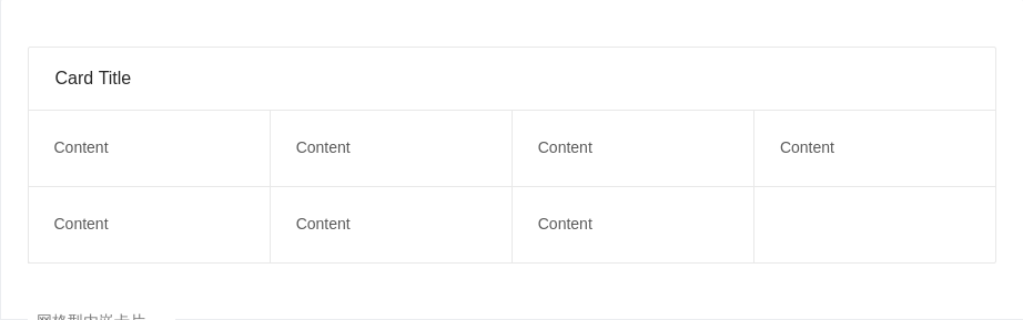
网格型内嵌卡片
一种常见的卡片内容区隔模式。
<template><a-card title="Card Title"><a-card-grid style="width:25%;textAlign:'center'">Content</a-card-grid><a-card-grid style="width:25%;textAlign:'center'">Content</a-card-grid><a-card-grid style="width:25%;textAlign:'center'">Content</a-card-grid><a-card-grid style="width:25%;textAlign:'center'">Content</a-card-grid><a-card-grid style="width:25%;textAlign:'center'">Content</a-card-grid><a-card-grid style="width:25%;textAlign:'center'">Content</a-card-grid><a-card-grid style="width:25%;textAlign:'center'">Content</a-card-grid></a-card></template>
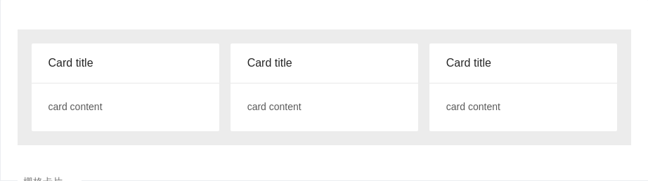
栅格卡片
在系统概览页面常常和栅格进行配合。
<template><div style="background-color: #ececec; padding: 20px;"><a-row :gutter="16"><a-col :span="8"><a-card title="Card title" :bordered=false><p>card content</p></a-card></a-col><a-col :span="8"><a-card title="Card title" :bordered=false><p>card content</p></a-card></a-col><a-col :span="8"><a-card title="Card title" :bordered=false><p>card content</p></a-card></a-col></a-row></div></template>
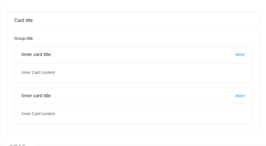
内部卡片
可以放在普通卡片内部,展示多层级结构的信息
<template><a-card title="Card title"><p style="fontSize: 14px;color: rgba(0, 0, 0, 0.85); marginBottom: 16px;fontWeight: 500">Group title</p><a-card title="Inner card title"><a href="#" slot="extra">More</a>Inner Card content</a-card><a-card title="Inner card title" :style="{ marginTop: '16px' }"><a href="#" slot="extra">More</a>Inner Card content</a-card></a-card></template>
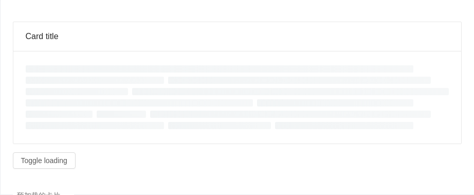
预加载的卡片
数据读入前会有文本块样式
<template><div><a-card :loading="loading" title="Card title">whatever content</a-card><a-button @click="handleClick" style="marginTop: 16px">Toggle loading</a-button></div></template><script>export default {data() {return {loading: true,}},methods: {handleClick() {this.loading = !this.loading}},}</script>
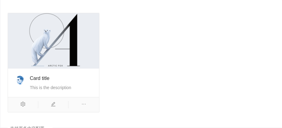
支持更多内容配置
一种支持封面、头像、标题和描述信息的卡片。
<template><a-cardhoverablestyle="width: 300px"><imgalt="example"src="https://gw.alipayobjects.com/zos/rmsportal/JiqGstEfoWAOHiTxclqi.png"slot="cover"/><template class="ant-card-actions" slot="actions"><a-icon type="setting" /><a-icon type="edit" /><a-icon type="ellipsis" /></template><a-card-metatitle="Card title"description="This is the description"><a-avatar slot="avatar" src="https://zos.alipayobjects.com/rmsportal/ODTLcjxAfvqbxHnVXCYX.png" /></a-card-meta></a-card></template>
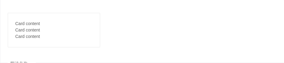
简洁卡片
只包含内容区域。
<template><a-card style="width: 300px"><p>Card content</p><p>Card content</p><p>Card content</p></a-card></template>
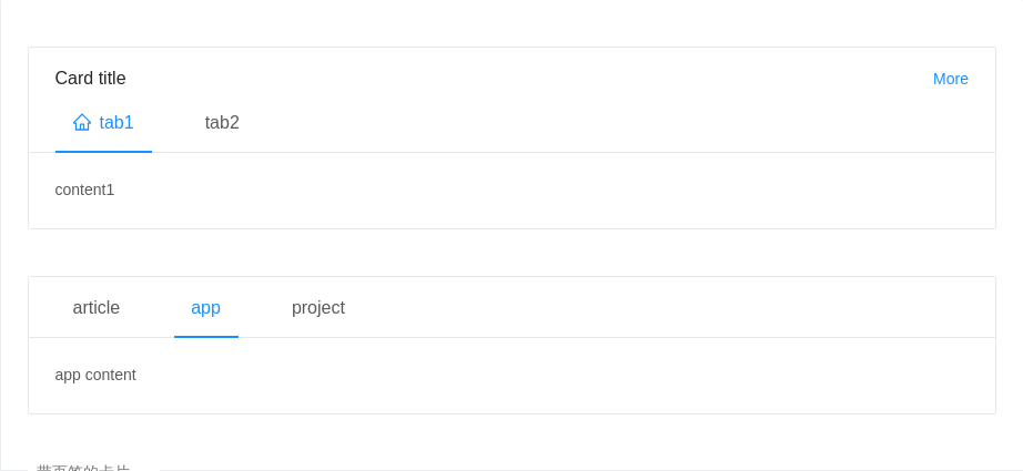
带页签的卡片
可承载更多内容
<template><div><a-cardstyle="width:100%"title="Card title":tabList="tabList":activeTabKey="key"@tabChange="key => onTabChange(key, 'key')"><span slot="customRender" slot-scope="item"><a-icon type="home"/>{{item.key}}</span><a href="#" slot="extra">More</a>{{contentList[key]}}</a-card><br /><br /><a-cardstyle="width:100%":tabList="tabListNoTitle":activeTabKey="noTitleKey"@tabChange="key => onTabChange(key, 'noTitleKey')"><p v-if="noTitleKey === 'article'">article content</p><p v-else="noTitleKey === 'app'">app content</p><p v-else="noTitleKey === 'project'">project content</p></a-card></div></template><script>export default {data () {return {tabList: [{key: 'tab1',// tab: 'tab1',scopedSlots: { tab: 'customRender'}}, {key: 'tab2',tab: 'tab2',}],contentList: {tab1: 'content1',tab2: 'content2',},tabListNoTitle: [{key: 'article',tab: 'article',}, {key: 'app',tab: 'app',}, {key: 'project',tab: 'project',}],key: 'tab1',noTitleKey: 'app',}},methods: {onTabChange (key, type) {console.log(key, type)this[type] = key},},}</script>
API
Card
| 参数 | 说明 | 类型 | 默认值 |
|---|---|---|---|
| actions | 卡片操作组,位置在卡片底部 | slots | - |
| activeTabKey | 当前激活页签的 key | string | - |
| headStyle | 自定义标题区域样式 | object | - |
| bodyStyle | 内容区域自定义样式 | object | - |
| bordered | 是否有边框 | boolean | true |
| cover | 卡片封面 | slot | - |
| defaultActiveTabKey | 初始化选中页签的 key,如果没有设置 activeTabKey | string | 第一个页签 |
| extra | 卡片右上角的操作区域 | string|slot | - |
| hoverable | 鼠标移过时可浮起 | boolean | false |
| loading | 当卡片内容还在加载中时,可以用 loading 展示一个占位 | boolean | false |
| tabList | 页签标题列表, 可以通过scopedSlots属性自定义tab | Array<{key: string, tab: any, scopedSlots: {tab: 'XXX'}}> | - |
| title | 卡片标题 | string|slot | - |
| type | 卡片类型,可设置为 inner 或 不设置 | string | - |
事件
| 事件名称 | 说明 | 回调参数 |
|---|---|---|
| tabChange | 页签切换的回调 | (key) => void |
Card.Grid
Card.Meta
| Property | Description | Type | Default |
|---|---|---|---|
| avatar | 头像/图标 | slot | - |
| description | 描述内容 | string|slot | - |
| title | 标题内容 | string|slot | - |
