 我的书签
我的书签
 添加书签
添加书签 移除书签
移除书签- 标签 Tag
- 何时使用
- 代码演示
- 基本用法
- 可选择
- 多彩标签
- 动态添加和删除
- 热门标签
- 控制关闭状态
- API
- Tag
- 事件
- Tag.CheckableTag
- 事件
标签 Tag
进行标记和分类的小标签。
何时使用
- 用于标记事物的属性和维度。
- 进行分类。
代码演示
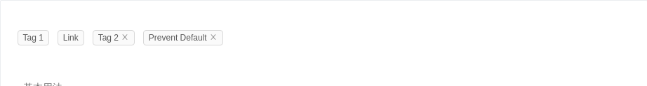
基本用法
基本标签的用法,可以通过添加 closable 变为可关闭标签。可关闭标签具有 onClose afterClose 两个事件。
<template><div><a-tag>Tag 1</a-tag><a-tag><a href="https://github.com/vueComponent/ant-design">Link</a></a-tag><a-tag closable @close="log">Tag 2</a-tag><a-tag closable @close="preventDefault">Prevent Default</a-tag></div></template><script>export default {methods: {log (e) {console.log(e)},preventDefault (e) {e.preventDefault()console.log('Clicked! But prevent default.')},},}</script>
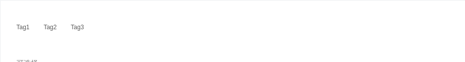
可选择
可通过 CheckableTag 实现类似 Checkbox 的效果,点击切换选中效果。
该组件为完全受控组件,不支持非受控用法。
<template><div><a-checkable-tag v-model="checked1" @change="handleChange">Tag1</a-checkable-tag><a-checkable-tag v-model="checked2" @change="handleChange">Tag2</a-checkable-tag><a-checkable-tag v-model="checked3" @change="handleChange">Tag3</a-checkable-tag></div></template><script>export default {data () {return {checked1: false,checked2: false,checked3: false,}},methods: {handleChange (checked) {console.log(checked)},},}</script>
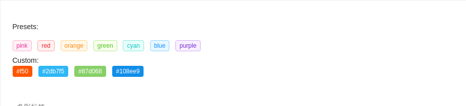
多彩标签
我们添加了多种预设色彩的标签样式,用作不同场景使用。如果预设值不能满足你的需求,可以设置为具体的色值。
<template><div><h4 style="margin-bottom: 16px">Presets:</h4><div><a-tag color="pink">pink</a-tag><a-tag color="red">red</a-tag><a-tag color="orange">orange</a-tag><a-tag color="green">green</a-tag><a-tag color="cyan">cyan</a-tag><a-tag color="blue">blue</a-tag><a-tag color="purple">purple</a-tag></div><h4 style="margin: '16px 0'">Custom:</h4><div><a-tag color="#f50">#f50</a-tag><a-tag color="#2db7f5">#2db7f5</a-tag><a-tag color="#87d068">#87d068</a-tag><a-tag color="#108ee9">#108ee9</a-tag></div></div></template>
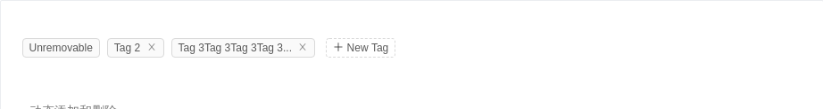
动态添加和删除
用数组生成一组标签,可以动态添加和删除,通过监听删除动画结束的事件 afterClose 实现。
<template><div><template v-for="(tag, index) in tags"><a-tooltip v-if="tag.length > 20" :key="tag" :title="tag"><a-tag :key="tag" :closable="index !== 0" :afterClose="() => handleClose(tag)">{{`${tag.slice(0, 20)}...`}}</a-tag></a-tooltip><a-tag v-else :key="tag" :closable="index !== 0" :afterClose="() => handleClose(tag)">{{tag}}</a-tag></template><a-inputv-if="inputVisible"ref="input"type="text"size="small":style="{ width: '78px' }":value="inputValue"@change="handleInputChange"@blur="handleInputConfirm"@keyup.enter="handleInputConfirm"/><a-tag v-else @click="showInput" style="background: #fff; borderStyle: dashed;"><a-icon type="plus" /> New Tag</a-tag></div></template><script>export default {data () {return {tags: ['Unremovable', 'Tag 2', 'Tag 3Tag 3Tag 3Tag 3Tag 3Tag 3Tag 3'],inputVisible: false,inputValue: '',}},methods: {handleClose (removedTag) {const tags = this.tags.filter(tag => tag !== removedTag)console.log(tags)this.tags = tags},showInput () {this.inputVisible = truethis.$nextTick(function () {this.$refs.input.focus()})},handleInputChange (e) {this.inputValue = e.target.value},handleInputConfirm () {const inputValue = this.inputValuelet tags = this.tagsif (inputValue && tags.indexOf(inputValue) === -1) {tags = [...tags, inputValue]}console.log(tags)Object.assign(this, {tags,inputVisible: false,inputValue: '',})},},}</script>

热门标签
选择你感兴趣的话题。
<template><div><strong :style="{ marginRight: 8 }">Categories:</strong><template v-for=" tag in tags"><a-checkable-tag:key="tag":checked="selectedTags.indexOf(tag) > -1"@change="(checked) => handleChange(tag, checked)">{{tag}}</a-checkable-tag></template></div></template><script>export default {data () {return {checked1: false,checked2: false,checked3: false,tags: ['Movies', 'Books', 'Music', 'Sports'],selectedTags: [],}},methods: {handleChange (tag, checked) {const { selectedTags } = thisconst nextSelectedTags = checked? [...selectedTags, tag]: selectedTags.filter(t => t !== tag)console.log('You are interested in: ', nextSelectedTags)this.selectedTags = nextSelectedTags},},}</script>
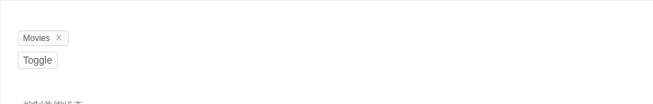
控制关闭状态
通过 visible 属性控制关闭状态。
<template><div><a-tagclosablev-model="visible">Movies</a-tag><br /><a-buttonsize="small"@click="()=>{this.visible = !this.visible}">Toggle</a-button></div></template><script>export default {data() {return {visible: true,}}}</script>
API
Tag
| 参数 | 说明 | 类型 | 默认值 |
|---|---|---|---|
| afterClose | 关闭动画完成后的回调 | () => void | - |
| closable | 标签是否可以关闭 | boolean | false |
| color | 标签色 | string | - |
| visible(v-model) | 是否显示标签 | boolean | true |
事件
| 事件名称 | 说明 | 回调参数 |
|---|---|---|
| close | 关闭时的回调 | (e) => void |
Tag.CheckableTag
| 参数 | 说明 | 类型 | 默认值 |
|---|---|---|---|
| checked(v-model) | 设置标签的选中状态 | boolean | false |
事件
| 事件名称 | 说明 | 回调参数 |
|---|---|---|
| change | 点击标签时触发的回调 | (checked) => void |
